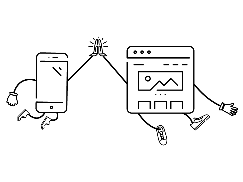
As you may already know, we live in a world engulfed in technology. The rate of technological progression is astounding and sometimes even alarming. The computer has gotten smaller and cheaper to the point where they fit within our pockets. Users are no longer tethered to their desktop, they can now browse the internet almost anywhere via their smart phone. Subsequently, there has been a heavy increase in mobile internet browsing to the point where it has recently overtaken desktop browsing. So why would you develop a site with desktop as your focus and allow mobile to be an after thought? Luke Wroblewski coined the term ‘Mobile First’, meaning that websites and apps should be designed for–you guessed it–mobile first.
To expand, mobile is the first medium you should cater your website to be accessed through, followed by computer desktops and tablets. Starting with mobile allows you to take advantage of the growth it is seeing, and engage your customers where they are spending most of their time. It’s important to stay on the forefront of technology and how customers are experiencing it.
Previously, there were two schools of thought on mobile web development:
1. A responsive design needs to be carefully created to ensure that readers click through to a site that they can read and navigate, and is optimized for the size of device they are using. Ultimately, the device will push your website to respond to it and automatically adjust. Your domain name is the same, it keeps your link equity, and Google search prefers this method.
2. Another option is to create a mobile-specific site that will provide the same information as your normal domain, but in a form that is much more mobile friendly. Navigation on mobile specific sites can sometimes be more user friendly than a responsive designed site, but there are a few drawbacks. Mobile specific sites use a different domain (m.domainname.com), and a completely separate codebase. This will likely hurt your search and cost you additional maintenance down the road.
In 2015, you need to think mobile first. At the current pace of change it is hard to tell exactly where trends in technology are headed, but catch the wave of mobile before its too late. The important part is creating a mobile friendly user experience where visitors can navigate your site and easily find the information they seek. Smart phone usage is at an all-time high and shouldn’t be taken lightly. Online marketing doesn’t stop with the PC, so start thinking about how your website currently deals with mobile users and how that experience can be improved.